

Something happened to me when I bought all those accessories to play with in the living room last month.
Something good.
If you remember, I mentioned I bought a bunch of things to "try" to see what would work. I remember thinking: anything grey, anything teal, anything cognac (or gold), anything turquoise, black or white.
I went to a bunch of stores over a few days. I bought lampshades, pillows, throws and tchotkes. I bought all. the. things.
After my Mom had finished the slipcover, we put it on the couch and started "playing"
First, I decided between two lampshades: gold or grey? The gold didn't look substantial enough, so the grey was quickly decided.
The pillows, too, were pretty much a given. I'd had a heck of a time finding any that might work. So these: navy and dull turquoise made the cut. (I had a brighter, greener turquoise I considered but they lost their shape in less than a week, so they were not going to stay.
By the time I thought to take pictures, we basically just had the blankets to play with.
First, we tried the cream coloured cable knit blanket.

Not enough oomph. I like oomph.
Next up, a soft grey and cream with a cool pattern.
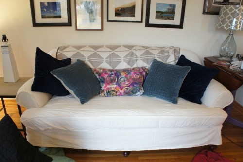


I loved this. I thought that crazy pillow in the middle would be a wonderful dash of the unexpected and "bohemian."
Next, with the zebra pillow:

I really could not decide which one I liked more--so I sent Mom home to sew up both the day before taking the photos for the reveal. That night, reviewing the photos, I realised the black and white was best--not only did it repeat the high contrast thing going on, but my other two chairs had black and white upholstery. It was meant to be. Whereas, other than my pink flower topped cactus, I had no other pink in the room. (A colour should be repeated at least three times in order for it to look intentional and balanced.)
So, the living room has a colour palette:
neutrals: black, white, cream, grey, navy, cognac
colours: deep blue-blue-green, turquoise.

(photo from the reveal)
That turned out to be valuable information when it came time to re-do my kitchen for the style cure.

No comments :
Post a Comment